
POD Mockup Strategy for UK Sellers: Match Visuals to Marketplace and Product
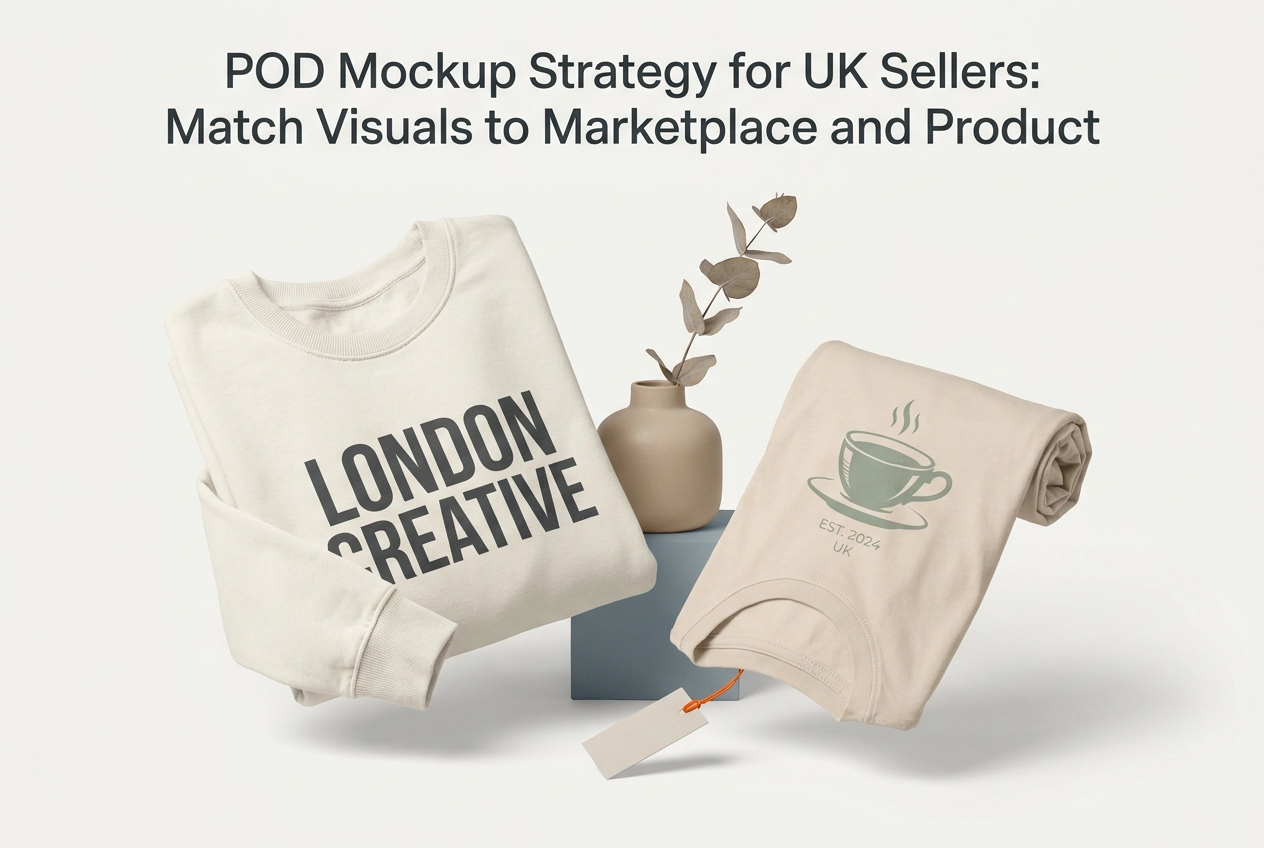
Most print on demand services give sellers the same advice: use a lifestyle image, make it look aspirational, and let the product speak for itself. That advice is not wrong, but it is incomplete, and for UK sellers competing across Etsy, Amazon, and independent Shopify stores, incomplete is expensive.
The European POD market is valued at USD 2.45 billion in 2025 and is projected to reach USD 17.06 billion by 2034. Buyer behaviour in the UK is specific. Shoppers on Etsy UK browse differently than shoppers on Amazon UK, and neither group responds to visuals the same way a Shopify customer does. Layer in product category differences, from apparel to mugs to wall art to stationery, and the idea of a single universal mockup strategy collapses quickly.
This post replaces guesswork with a structured decision matrix. You will learn what each mockup style communicates, how buyer expectations shift across UK marketplaces, and precisely which visual format to use for each product category on each platform. Start here, and you will generate the right asset on the first attempt.
Why UK POD Sellers Cannot Afford Generic Mockup Choices

That growth trajectory means more competitors and more listings for every UK seller, which makes mockup selection a material business decision, not a cosmetic one.
The product landscape is widening simultaneously. Apparel commands 57.4% of the European POD market, but home décor is the fastest-growing segment at a 13.7% CAGR. UK sellers are no longer competing across a single visual template and product type; they are competing across mugs, wall art, stationery, and garments at once, each carrying its own buyer expectations.
Most sellers default to whatever mockup template came bundled with their print-on-demand services provider, not because it is the right choice, but because no structured alternative exists.
That default carries a real cost. Buyer expectations on Etsy UK, Amazon UK, and Shopify are structurally different. A lifestyle image that drives clicks on Etsy can actively reduce credibility on Amazon, where catalogue-style studio shots set the visual standard. Using one format everywhere is a conversion risk on every channel where it does not fit. The wrong image suppresses sales even when the product and price are competitive.
This piece introduces a practical decision matrix that removes the guesswork by pairing product category and marketplace with the mockup style most aligned with how buyers on each channel actually shop.
The Three Mockup Styles and What Each One Communicates
Lifestyle mockups place the product in a real-world context, worn by a model, displayed in a room, or set within an environment that reflects a particular identity or occasion. They do not just show the product; they sell the version of life it belongs to. This is why they dominate social-first channels and discovery-led browsing, where emotional resonance drives the click rather than specification or price.

Flat-lay mockups arrange products on a clean surface, typically shot from above, with deliberate prop choices and considered composition. The visual language communicates craft, intentionality, and aesthetic care. In gift and stationery categories especially, where the design itself is the primary selling point, a well-executed flat-lay lets the print speak without distraction.
Studio mockups isolate the product against a white or neutral background under controlled lighting. This format signals professionalism and consistency, which is why it is the dominant standard on retail-style marketplaces where buyers are comparing multiple listings simultaneously and need to evaluate clearly and quickly.
Each style triggers a distinct cognitive response at the point of browsing. A studio image on a discovery platform can feel cold and generic. A lifestyle image on a price-comparison platform can feel evasive, as though the seller is obscuring product detail. Mismatching style to channel creates a trust gap even when the product and price are entirely competitive.
Treating these three styles as strategic tools, each matched to a specific buyer context, is the foundation of a productive print-on-demand mockup workflow that generates professional results without wasted effort.
How Buyer Expectations Differ Across Etsy UK, Amazon UK, and Shopify
Knowing which mockup style does what is only half the equation. The other half is understanding where your buyer is mentally when they first see your product image, because that varies by platform.
Etsy UK buyers arrive in discovery mode. They are browsing, not yet decided, often searching for something handmade, personalised, or distinctive. Lifestyle and flat-lay imagery tends to perform well here because the visual context matches the emotional register of the platform's browse experience.
Amazon UK buyers have already narrowed their choice. They are comparing options within a category, weighing price, ratings, and delivery speed. Studio-style images on clean backgrounds suit that comparison process. Multiple angles and clear product detail build trust with a price-aware shopper who has three tabs open.
Shopify visitors are arriving warm. Most have clicked through from a social ad or marketing email and already have some familiarity with the brand. Lifestyle mockups that reinforce a coherent visual identity tend to serve them well here, because they reward the brand recognition the visitor arrived with.
These are not stylistic preferences. They are structural patterns shaped by how each platform routes traffic and presents choices. Understanding how an AI mockup generator turns designs into professional images instantly becomes especially relevant here, because UK sellers running a print on demand business across more than one channel need a channel-specific mockup library, not one set of images stretched across every marketplace.
Decision Matrix: Apparel (T-Shirts, Hoodies, Sweatshirts, Tank Tops)
Etsy UK: Lifestyle mockup is the primary format. Buyers browsing for personalised or graphic tees expect to see the garment worn, contextualised by a model or setting that reflects the design's target identity. A flat-lay can supplement a listing but rarely converts as the hero image because it removes the aspirational context Etsy shoppers browse for.
Amazon UK: Studio mockup on a clean white background is the baseline requirement. Amazon's visual environment strongly favours this format, and buyers comparing listings default to the most legible, professionally presented image. Front and back studio shots work well as the hero image; lifestyle shots can supplement as secondary images where permitted.
Shopify: Lifestyle mockup with brand-consistent styling is the strongest performer. Shopify visitors typically arrive via a social ad or brand content, carrying some brand familiarity already. High-quality on-figure shots that match the store's visual identity reinforce purchase confidence in a way a generic studio shot cannot replicate.
Maintaining separate mockup sets per marketplace is more likely to match buyer expectations on each channel than a single universal image. The practical barrier is production time, but tools that generate multiple professional variations quickly make this manageable.
Mocksy's one-click mockup workflow is built specifically for apparel, supporting t-shirts, sweatshirts, hoodies, and tank tops across a wide range of garment styles and colour options, making it well-suited for building a channel-specific library covering all three formats. Try Mocksy free.
Decision Matrix: Mugs
Mugs follow a different logic to apparel, and the channel split is just as pronounced.
Etsy UK rewards a lifestyle flat-lay as the primary image. Buyers searching for gift mugs or novelty mugs are in discovery mode, responding to a styled table scene where the mug sits as the centrepiece alongside complementary props. The emotional context does the selling, but the design must remain clearly legible within that setting; a beautifully composed shot that obscures the print loses its commercial purpose entirely.
Amazon UK demands the opposite approach. Mug buyers here are typically price-comparing across dozens of listings in a single session, so a studio mockup on a plain background with multiple angles is the baseline expectation. Lifestyle elements can distract a buyer who is comparing multiple listings on price and specification; clarity and print legibility take priority over atmosphere.
Shopify supports a hybrid format effectively. A lifestyle hero image establishes brand context and emotional appeal, followed by a clean studio shot that communicates product detail. Shopify visitors have greater tolerance for sequential visual exploration before converting, making this the one channel where both styles earn their place on the same page.
For gift-positioned mugs on Etsy UK specifically, packaging mockups are worth adding to the image set. Showing the mug in a gift-ready presentation, boxed or wrapped, elevates perceived value and justifies premium pricing in the personalised gift category.
One principle holds across all three channels: the print must be readable at thumbnail size. Regardless of style, mockup angle and crop choices should be made with the search results grid in mind, not just the full-size product page.
Decision Matrix: Wall Art and Prints
Wall art shifts the visual challenge considerably. Unlike mugs, where the design must read at thumbnail scale, wall art buyers need spatial context before they commit.
Etsy UK
Lifestyle room-set mockups are the near-universal expectation here. Etsy UK buyers browsing wall art are in discovery mode, imagining how a print will transform a specific wall in their home. An isolated product shot on a plain background removes exactly the context they need. Room-set images are the dominant format in this category on discovery-led marketplaces and align with how buyers visualise a purchase, making them the only credible hero image choice.
Amazon UK
The formula shifts. Lead with a studio shot that clearly shows print quality, paper weight, and framing or mount options. Amazon buyers are comparing specifications and value, so the hero image must answer product questions instantly. Add a secondary room-set image to satisfy the visualisation need without violating Amazon's visual hierarchy expectations.
Shopify
Generic room-set mockups underperform here. When a store specialises in a defined aesthetic, whether Scandinavian minimalism, botanical illustration, or maximalist colour, the mockup must reinforce that niche visually. A mismatched room setting creates aesthetic friction that erodes brand trust.
The Scale Cue Rule
Regardless of channel, always include at least one mockup that communicates the print's physical dimensions through room context. Buyers who cannot gauge a print's physical dimensions from the image are more likely to be disappointed on arrival, and a print shown floating in a white void gives buyers no reliable reference point.
Decision Matrix: Stationery and Paper Products
Stationery follows a different logic to wall art. The visual job shifts from spatial context to tactile suggestion: buyers cannot touch the paper, so the mockup must do that sensory work for them.
Etsy UK buyers in the stationery category arrive with a gift-discovery or personal-treat mindset. Styled flat-lays are a well-established format in this category. Arrange notebooks, greeting cards, or art prints alongside complementary props such as a pen, a sprig of eucalyptus, or a ceramic coffee cup, and the image signals artisan quality before the buyer reads a single word. In the personalised stationery niche specifically, this format aligns with the browse and gift-discovery mindset common among Etsy UK stationery buyers, because props provide social and emotional context that justifies a premium price point.
Amazon UK stationery buyers are typically purchasing for a functional reason: a planner, a card multipack, a notepad for the desk. Studio-style close-up shots that clearly show paper weight, print finish, and product dimensions are the priority. Clarity beats aesthetics; lifestyle styling adds cognitive load without increasing purchase confidence.
Shopify rewards a flat-lay lifestyle hybrid, particularly for gifting-positioned ranges. Packaging mockups showing a branded envelope alongside a card, or a gift set laid out ready to wrap, communicate premium positioning that marketplace listings rarely achieve.
Across Etsy UK and Shopify, packaging mockups carry particular conversion weight. A gift-ready presentation communicates care and perceived quality beyond the product itself.
Using the same prop palette and composition across your full stationery range builds a cohesive shop aesthetic that supports a coherent shop aesthetic that encourages continued browsing, not just individual listings.
How to Apply the Decision Matrix Without Multiplying Your Workload
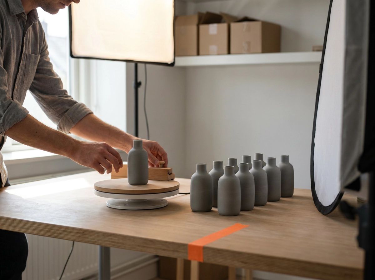
The real barrier to executing this matrix is not complexity, it is production time. Generating separate mockup sets per channel and product type feels like tripling the workload, which is why most sellers default to one image used everywhere. That shortcut costs conversions.
The fix is sequencing, not working harder. Batch by product category first, then by marketplace format. Complete all your apparel mockups across Etsy, Amazon, and Shopify before moving to mugs or wall art, not the other way around. Staying in one creative mode per session reduces decision fatigue and speeds up execution significantly.
For apparel, the bottleneck disappears with the right tool. Mocksy's one-click workflow removes the apparel production bottleneck, details in the Apparel section above.
Prioritise where the return is highest. If apparel drives the majority of revenue in your print on demand business, build out your channel-specific apparel mockup sets first. Secondary categories can follow once the highest-value library is complete.
Finally, pair this matrix with a simple reference card: one row per channel, one column per product type, mockup style pre-filled. When a new product launches, the brief is already written before you open any tool. That single habit removes the biggest recurring decision from your workflow entirely.
Start with the Right Visual, Not the Easiest One
With the decision matrix in place and your production workflow streamlined, one principle ties everything together: choose the right visual for the right context, not the one that requires the least effort to produce.
Apply the matrix one product category at a time. Start with your strongest-performing channel, build that mockup library first, then extend outward. This keeps the work focused and the quality consistent.
For UK sellers running apparel across multiple channels, Mocksy is a practical starting point, try it free.
The stakes are straightforward. Strong visuals do not rescue a weak product, but weak visuals reliably suppress a strong one. Getting the visual right from the first upload is not a refinement for later; it is a structural advantage worth building now.
Conclusion
Your mockup strategy is not a finishing touch; it is a foundational decision that shapes whether buyers stop scrolling or keep moving.
Three takeaways matter most. First, mockup style communicates intent before a buyer reads a single word. Second, Etsy UK, Amazon UK, and Shopify attract buyers in structurally different mindsets that require different visual approaches. Third, the decision matrix removes guesswork and protects your time without sacrificing quality.
Start with your highest-performing channel, apply the correct mockup style for your product category, and build outward from there.
UK sellers who treat visuals as a strategic asset rather than an afterthought consistently protect their conversion rates in an increasingly competitive POD market.
Your next upload is an opportunity to get it right from the start. Use the matrix, choose the right visual, and give your product the presentation it deserves.