
Studio Clean or In-Context: Matching Style to Product Type
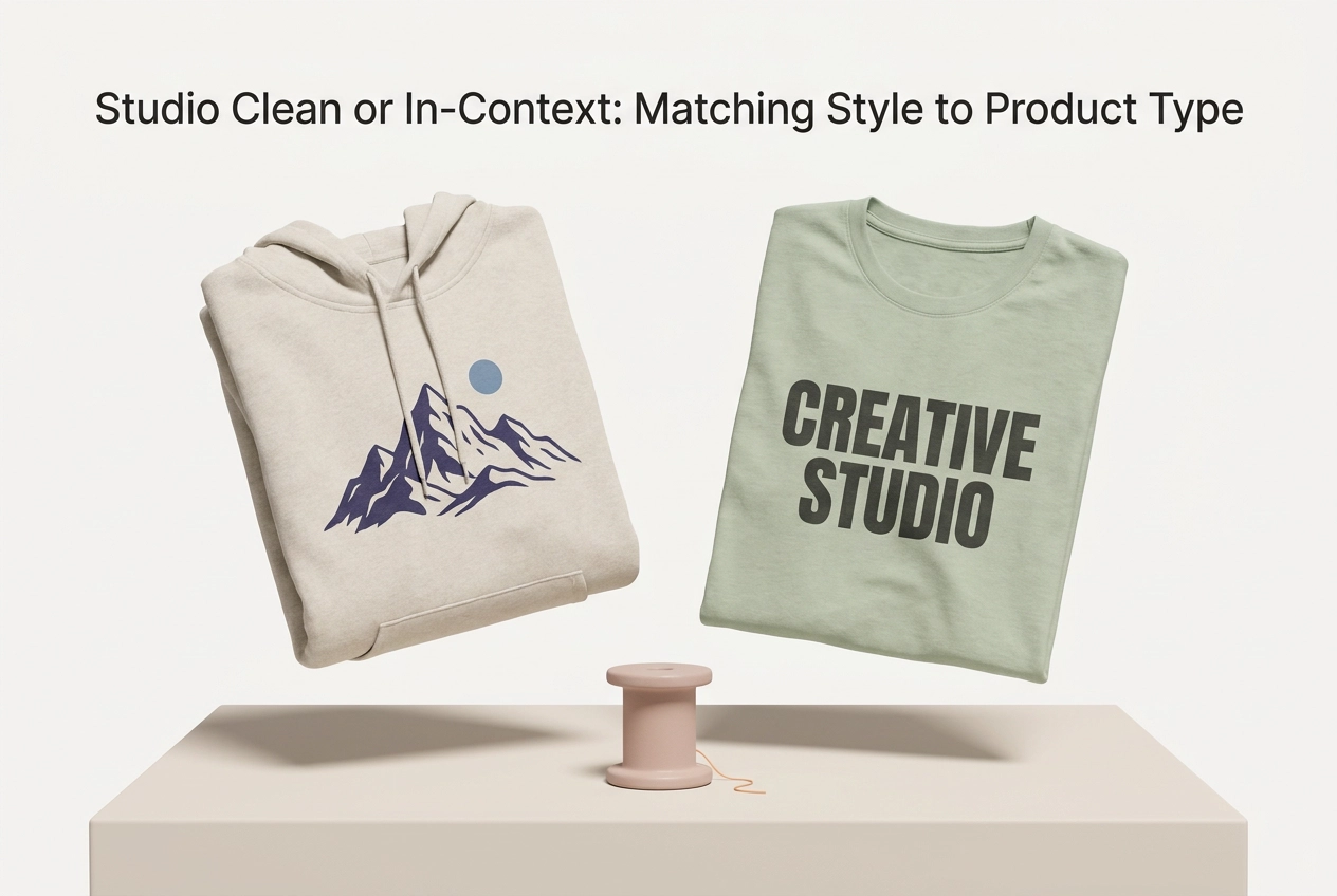
You have probably seen it: a beautifully clean product page that works perfectly for a structured jacket, then falls flat for a t-shirt that really needs to be seen on a body. That is the hidden cost of a single house style. When a brand forces one visual approach across every category, some products lose the context that actually answers the buyer's question.
The right choice is not about brand preference. It comes down to what the customer needs to judge. Products evaluated on design detail often reward a crisp studio packshot. Products evaluated on fit, drape, and use often need a scene. That detail-versus-use split is the decision method this guide builds on, and we will apply it throughout.
In the sections ahead, you will learn why one house style leaves categories underserved, how studio clean and in-context styles differ, and how to let the buying question pick the style. We will cover design-detail products, use-based products, clothing mockups as a hybrid case, and social media mockups. You will also see common mistakes, production workflows, and a per-product image plan you can actually use.
For print-on-demand sellers, Mocksy helps you produce both styles quickly. Create professional t-shirt, sweatshirt, hoodie, and tank top mockups in one click, with 11 garment models and 157 colors available, and see how a per-product image plan fits your workflow. You can test that plan with the free trial covered later in this guide.
Why One House Style Leaves Some Categories Underserved
Many stores adopt a single photographic style and repeat it across every listing, leaving half the catalogue answering a question the buyer never asked. This mirrors the pattern in POD mockup strategy for UK sellers, where matching visuals to the product and marketplace is the deciding factor.
A design-led product shown only in a styled scene hides the exact detail the buyer came to inspect. A use-led product on a flat studio background feels abstract, with no sense of fit, scale or wear. The right visual style follows the buying question, not the brand's visual preference.
For a solo seller, the stakes are concrete. When a shopper cannot confirm print placement, colour or silhouette from your page, many simply move on rather than asking.
This walkthrough defines both style families, applies a simple decision test, then works through apparel, channel context, and fixes for a store already standardised on one look.
Studio Clean vs In-Context: The Two Styles You Are Choosing Between
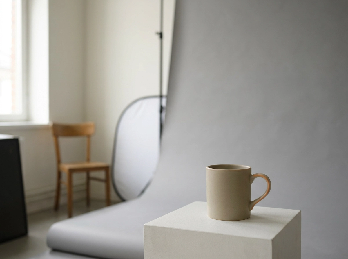
The previous section showed why a storewide look leaves categories underserved. Name the two options. A studio clean packshot uses a neutral or seamless background, even lighting, and a product or design filling the frame with nothing competing for attention. Its job is inspection. An in-context shot shows the product worn, held, styled, or placed in a setting that reveals scale, use, and mood. Its job is imagination.
Neither style is inherently better. They answer different buying questions, which is why one blanket rule across a store tends to fail one product group or the other.
Terminology: a mockup is a realistic preview image that shows your design on a product, and both style families can be produced as mockups rather than new photography.
For store pages, most listings do not need a permanent winner. They need a lead image plus supporting images, so both styles can sit on the same page doing different jobs. Visual failures here quietly cost sales, as this look at why online store conversion rates stall explains.
Let the Buying Question Pick the Style, Not the Brand
Before you assign a lead style, run one reusable test: write down the single question your buyer needs answered before they add to cart.
If the answer is about detail, clean leads. Questions like does the print align, is the colour accurate, is the artwork crisp all point to a studio clean treatment.
If the answer is about use, context leads. Questions like how does it sit, how big is it, could I wear this all point to a scene, a body or a setting.
Baymard Institute argues that every product should include at least one in-scale image, a useful benchmark for the context side of that split. Note the argument, not the percentage that circulates with it, since that figure comes without published method or sample detail.
The test works per product rather than per store because a mixed catalogue gets mixed treatment. That is exactly how you avoid underserving half your categories with one house rule, and it pairs well with a structured apparel mockup checklist as you apply it.
Design-Detail Products: Where a Clean Packshot Does the Selling
For design-detail products, the buying question is almost always about the artwork itself. Think of a graphic tee with fine line art, print-heavy apparel where placement is the product, or any item sold on the strength of a pattern or colourway. Clean wins here because nothing competes with the detail: no environmental colour cast, no competing texture, no shadow from a model's hair falling across the print, and no background stealing contrast from a thin white line.
A working checklist is straightforward: a front view, a back view, a close crop on the print itself, and one consistent lighting setup so a colour reads the same across every variant. Keep the same garment and background across shots too, so buyers compare your designs rather than the styling of each image. The common error is leading with a beautiful lifestyle shot, which can leave a detail-driven buyer guessing. Keep context shots as secondary support. If you are deciding where to invest mockup effort across your catalogue, see which POD products benefit most from professional mockups.
Use-Based Products: Where Context Answers the Question
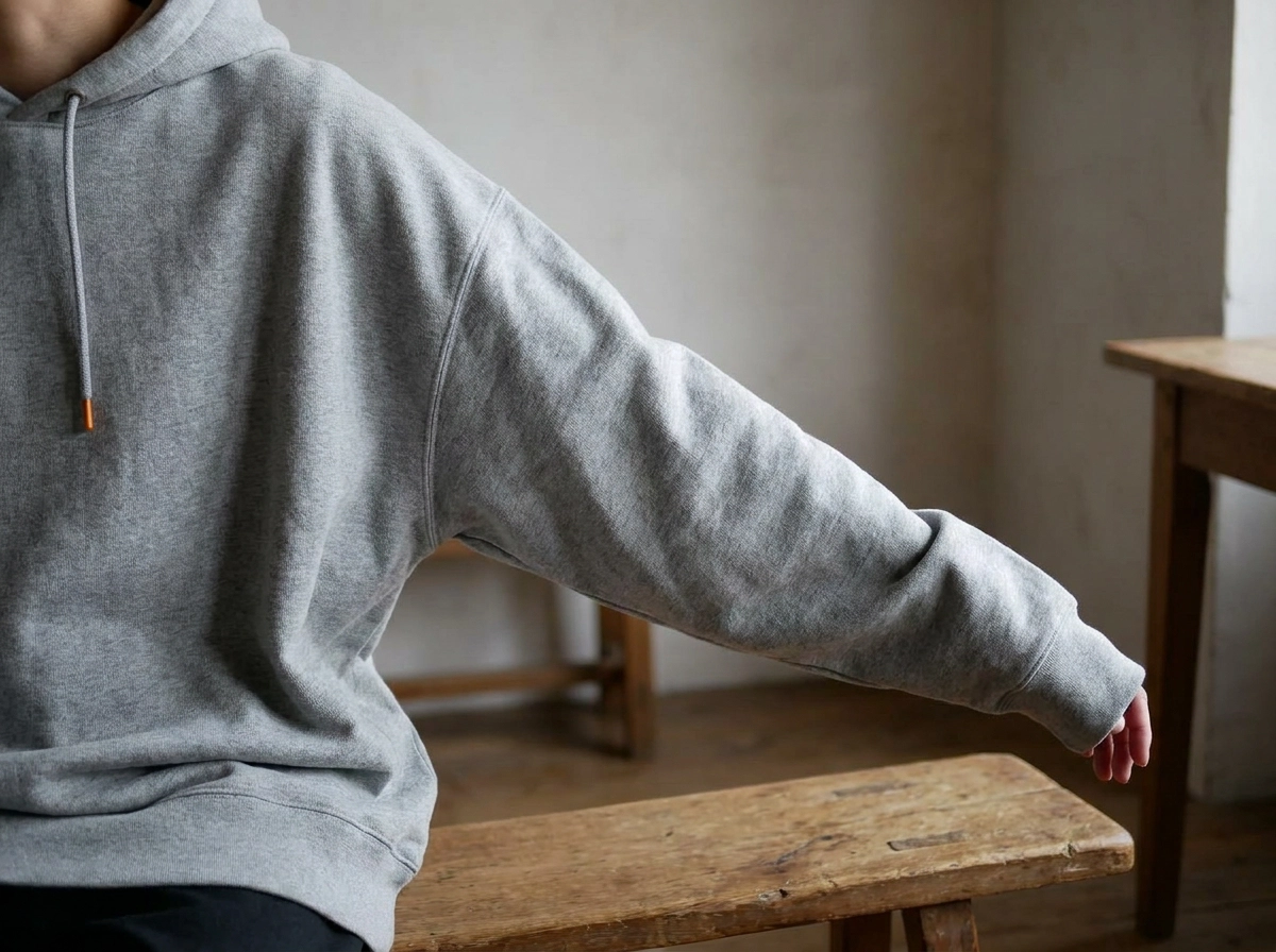
Some products sell on the silhouette, not the print. Oversized hoodies, relaxed sweatshirts and layered tank tops are judged on how they hang, how long they run and how they size. Shot flat on a seamless background, an oversized hoodie reveals nothing about drape or proportion, which is usually the reason the buyer is looking at it at all.
Three shots cover the gap: one on-body or in-scale, one detail crop, and a light variation in model or setting so more buyers can picture themselves in the piece. On crowded marketplaces, that sequence of image slots matters as much as the shot itself, as this guide to winning every listing image slot with AI mockups explains.
Label each shot clearly when it is a mockup of your design rather than a photograph of the exact garment you ship. Misleading product representation is a regulatory matter, not only a trust one (ASA misleading advertising code).
This is where a flat-only house style costs you most: these listings perform quietly and the design absorbs the blame for a fit problem.
Clothing Mockups: The Hybrid Case for Apparel
Apparel is where the clean-versus-context debate stops being a choice. Fabric and print fidelity pull toward clean; fit and drape pull toward context. Set a default: print-led apparel leads with a flat or clean shot, with an on-body image in the gallery as support. Fit-led apparel leads on-body, with a clean detail shot as proof. Mocksy's t-shirt, sweatshirt, hoodie and tank top mockups, across 11 garment models and 157 colours in total, let you produce both treatments for the same garment. Keep colourway discipline: use the same design and colour across clean and on-body shots, or the listing reads like two different products. For marketplace-specific guidance, see which mockup types sell best on Etsy and Amazon.
Social Media Mockups: A Channel Where Context Usually Leads
Apparel is not the only place where the buying question shifts. A social media mockup is a product preview composed for a feed, a story or a paid placement, not for a product page, so its job changes: it must stop a scroll, not survive close inspection. That is why context usually leads here. The feed rewards a scene, a moment and a mood faster than a white sweep, because the viewer is moving past rather than comparing details.
Keep one clean version in the kit regardless. Paid placements need the design to read at thumbnail size, and marketplace listings often crop tightly around the product. Format reality also matters: square, vertical and wide crops cut the frame differently, so compose with the product's position in mind instead of cropping one image four ways. A campaign does not need a separate shoot for each format or style when the same design can be exported in several treatments from one place, as this guide to using product mockups in social campaigns without a designer explains.
Mistakes That Come From Forcing One Style Everywhere
The social channel rewards mood and movement, but that same instinct can quietly damage your store. Forcing one house style across every category is where most of the trouble starts. A single rule means pages that need proof of detail and pages that need proof of use both end up with neither.
Consider a moody lifestyle image leading a print-led listing. The buyer's real question is whether the print sits straight and the colour is true, and a dim café scene answers neither. Reverse it, and a flat packshot on a fit-led item leaves size, drape and proportion unanswered, pushing the buyer toward a competitor who showed it worn.
Mixing lighting and backgrounds within one colourway family is just as costly. Genuine colour differences start to read as product differences, and the browsing buyer hesitates. Likewise, treating social and store pages as one job means reusing a feed image that crops badly or reads too small as a lead. For channel-specific visual criteria, see how to choose the right product image for each channel.
The fix is not a new house style; it is per-product judgement applied consistently.
Producing Both Styles Without Doubling Your Work
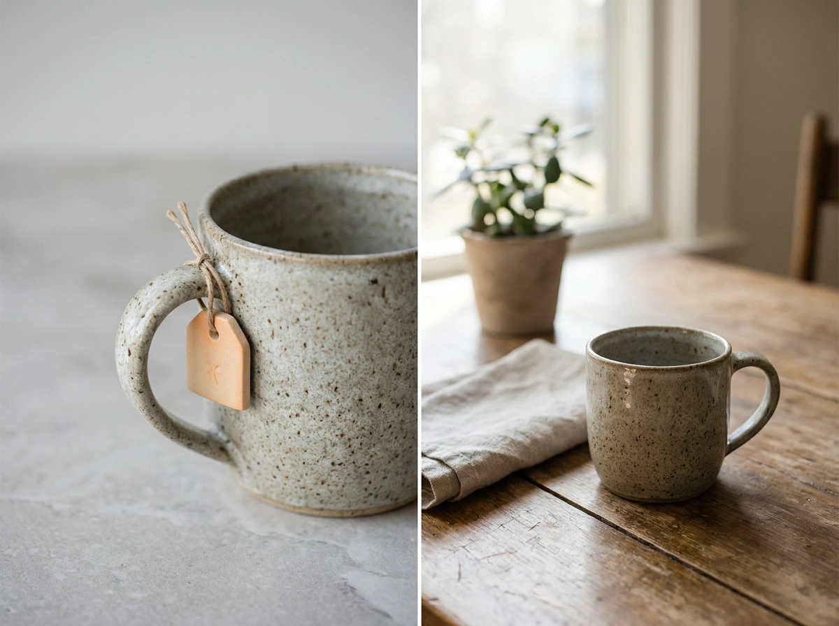
With the mistakes out of the way, the fix is a repeatable workflow rather than a new house style. For each product, run the buying-question test and assign a lead style: clean for detail-led items, in-context for use-led ones. Then generate both versions of the same design, so the gallery covers inspection and imagination without a second photo shoot.
Mocksy, an AI-powered mockup generator, creates multiple professional product mockups in one click for online stores, marketplaces and marketing campaigns. Its free trial gives you three mockups with no registration required, enough to produce one clean and one in-context version of the same design and compare them side by side.
Record each category’s decisions in a short rule sheet: lead style, crop approach and colourway conventions. New products then follow the same logic instead of reopening the debate. The payoff is qualitative but real: faster listings, consistent pages across categories, and no photo shoot dependency for every new design.
Mockup Style Questions Sellers Ask
A style rule sheet only helps if it answers the recurring questions. Use these short answers as your reference.
Clean or lifestyle, and can one design appear both ways? A studio clean mockup isolates the garment on a plain background for inspection. A lifestyle mockup shows it worn or styled to convey fit and mood. Yes, the same design can appear in both.
Should the lead image always be clean? No. Lead with clean when detail drives the sale. Lead with context when fit or use drives it.
Do clothing mockups need both clean and in-context shots on one apparel listing? Yes. Use a clean shot for print fidelity and an in-context shot for drape, then match colourways.
How many styles should a social media mockup set include for one campaign? Two treatments usually suffice: one contextual image for the feed and one clean, tightly cropped version for paid or marketplace placements. Crop for each format rather than assuming one frame fits all.
Can you produce both without new photography? Yes. Mockup generation creates both treatments from the same design file.
What does Mocksy support? T-shirts, sweatshirts, hoodies and tank tops only, with 11 garment models and 157 colours.
Build a Per-Product Image Plan Instead of a House Style
With those answers in hand, you can turn the buying-question test into a working plan in three short steps.
First, apply that test to your five best sellers.
Next, set a gallery plan for every listing: at least one in-scale or on-body shot plus one clean detail shot, so neither the use question nor the detail question is left unanswered.
Then keep a per-category rule sheet covering lead style, crop and colourway. Decide once, apply it consistently, and update it as new products arrive.
When you are ready to compare both treatments before committing to a lead style, the free Mocksy trial covered earlier in this guide is all you need.
Conclusion
Choosing between studio clean and in-context imagery is not about picking a favourite. It is about matching each product to the question your buyer is actually asking. Four takeaways stand out. First, let the buying question lead the style decision for every listing. Second, design-detail products need clean packshots while use-based products rely on context. Third, a consistent gallery plan with both treatments keeps every question answered. Fourth, you can produce both styles from a single design file without doubling your workload.
The next step is practical: run a short audit of your five best sellers, assign a lead style to each, and set a gallery plan. Then test both treatments side by side with the free Mocksy trial covered earlier and see which one starts conversations. Your product deserves the style that sells it best.