
One Design, Many Products: Keep Your POD Range Consistent
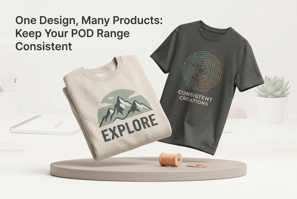
You have a strong design. It looks great on the t-shirt. But look at it on the mug. And the print. And the hoodie. Do they feel like one brand, or five unrelated listings? That disconnect is costing you sales.
Cross-product consistency is a business decision before it is a visual one. A shared visual system builds recognition and cuts production time. This post will show you how to achieve it across your entire range. We will explore why one design can read as five unrelated listings, the difference between a visual system and a template, and the six variables your whole range shares. You will learn to lock down your colour palette, type and placement zones, and background treatment across clothing mockups. We will walk through a worked example on a garment range and explain why mockups are the enforcement layer for your brand. Finally, we will look at where consistency pays off across your catalog. Mocksy helps you get there, letting you create multiple professional product mockups for t-shirts, sweatshirts, hoodies, and tank tops in just one click, with 11 garment models and 157 colours. You can try it for free with 3 mockups, no registration required.

Why One Design Can Read as Five Unrelated Listings
A t-shirt, a print and a mug carrying the same artwork should feel like one brand. Shot on different backgrounds, at different crops, with different shadows, they read as three separate sellers. Buyers rarely browse your shop page by page; they meet your range as a grid of thumbnails. Any visual system you build has to survive at roughly 200 pixels wide, where fine detail disappears and only colour, framing and consistency remain.
The rule for the whole piece is simple: variety in context, consistency in style. The product changes, the setting changes, but the visual grammar underneath stays fixed. This is a design decision, not a template decision, and it is what separates a collection from a pile of listings. Research on brand recognition supports building familiarity before changing what customers already know. In practice, a returning browser should recognise your range before reading a single title. Inconsistency costs sales quietly, a pattern covered in our guide to why UK online store conversion rates stall.
The commercial case is widely cited, though not independently verified: consistent brand presentation is often said to lift revenue by around 10 to 20 percent (originally credited to Lucidpress), and a signature colour is claimed to improve recognition by up to 80 percent.

Consistency Is a Business Decision Before It Is a Visual One
The fix is not a better template. It is a decision about what the range is for. Source 1 warns that companies treat consistency as a visual exercise while measuring brand performance separately from business results, and most POD sellers repeat that mistake at catalog scale.
Before designing anything, name the goal: more repeat buyers, more multi-product orders, a higher average order value, or faster listing production. A system with no target drifts within a month. As Source 1 puts it, the brand promise has to connect to the product experience, so each item carries the same character rather than only the same artwork file. Your product visuals are where that character first shows.
Then pick one signal and check it monthly: returning buyer rate, share of orders containing more than one product type, or minutes spent per new listing.
For scale: a secondary compilation reports that 77 percent of brands admit to publishing off-brand content at least occasionally (SHNO branding statistics compilation). Treat that as compilation-level evidence, not a primary study.
What a Visual System Is, and What a Template Is Not
With a goal fixed, the next distinction is practical. A template repeats an identical layout across every product. A visual system fixes a short set of rules, such as palette, type, placement logic, and background family, then lets those rules flex per item while the range still reads as one family.
The test is simple: swap the artwork. If the listing still clearly belongs to your range, you built a system. If it only works with the original design, you built a template.
Templates fail on a varied catalogue because a t-shirt, a sweatshirt, and a tank top have different print areas and proportions. A fixed layout either crops badly or looks stretched. Different products and marketplaces also need different crops, which is why matching visuals to marketplace and product type matters.
Borrowed decisions make this manageable. Every variable you fix once is a decision you do not remake per product, which is how one small rule set covers a whole range.
The Six Variables Your Whole Range Shares
Where a template fixes a layout, a system fixes a set of decisions. Your range shares six: colour palette, typography, placement zone, scale, background and mockup treatment.
Some are fixed exactly (hex codes, two typefaces). Others are fixed as ranges. A placement zone, for instance, works better defined by a top and bottom margin in percentages than by one precise coordinate.
Write the system as a one-page spec you can follow at 11pm: swatches with hex codes, two fonts with names and sizes, placement margins, a background family and a lighting direction. When a new product joins the range, the spec answers most questions before you open a design file.
The next three subsections tackle the variables that drift most visibly when left loose: colour, then type, placement and scale, then background and mockup treatment.
Colour Palette: Your Fastest Recognition Cue
Palette is the variable that repays fixing first, because colour reaches a buyer before a single word of your title does. That speed makes a two or three colour palette the cheapest recognition device in a catalog.
The rule: a dominant colour, one supporting colour and one accent. Give the accent one job only, such as small type or a trim-style detail, and apply it the same way on every product so the eye learns the pattern.
Then handle the garment colour variable. The same artwork rarely carries equal weight on a pale garment and a dark one, so list approved garment colours per design in the spec rather than trusting a screen preview. Mocksy's 157 colours across 11 garment models let you test a palette against real garment shades rather than imagined ones, and what to look for in an AI mockup generator as a Canadian seller covers the wider evaluation criteria.
One caveat: the often-quoted claim that a signature colour lifts recognition by up to 80 percent comes from a secondary compilation, so treat it as directional.
Type, Placement Zone and Scale: The Rules That Flex
With palette locked, typography is the next variable to fix. Limit your system to two typefaces and name the weight and size for each use, so a slogan on a hoodie and the same slogan on a tank top share a voice even when the size changes.
Place by zone, not coordinate. Set a chest zone for t-shirts, a wider zone for sweatshirts and hoodies, and a narrower central zone for tank tops. The silhouette changes; the rule does not.
Then set scale as a percentage of that zone. A practical starting rule is artwork filling 55 to 70 percent of the available print area on every product, so nothing looks tiny on one item and oversized on another.
This also answers the recurring question of how to make a mockup t shirt sit correctly. With a defined zone and scale range, the design is placed by rule instead of by eye.
Allow one deliberate break per range maximum. A single exception reads as intent; a second quietly becomes the default. Write the rules down and run them against a structured mockup review so drift surfaces before a listing goes live.
Background and Mockup Treatment Across Clothing Mockups
With type, placement and scale governed, the last visible variable is image treatment. Treat the background as part of the brand, not as leftover space. One background family, such as a consistent neutral or studio tone, makes separate clothing mockups read as one collection. Keep lighting direction and shadow softness constant too, because mismatched shadows quickly make a range look like stock imagery from different sources. Standardize crop logic: the same headroom, subject scale and aspect ratio in every listing image, so grid views line up.
Consistency is not repetition. Change the pose, add a flat lay or refresh seasonal styling, provided palette, type, crop and lighting rules still hold. Decide which image types your catalogue uses, flat lay or on-model, and apply the same treatment to all of them. When those rules are ready, generate 5 professional mockups in one click to test the set.
A Worked Example: One Design Across a Garment Range
With those background and treatment rules set, apply them to one abstract design: a single-colour wordmark. Step 1, t-shirts: place the wordmark inside the chest zone at 60 percent of the print area, limit garment colour to the approved light shades, and keep background and crop to spec. Step 2, sweatshirts and hoodies: widen the placement zone, hold the same scale percentage, keep palette and typography identical, and adjust only the crop so the fuller silhouette fits the frame. Step 3, tank tops: narrow the zone, reduce scale slightly to respect the smaller print area, and leave the rest of the rule set untouched so the item still reads as the same brand. Palette, typography, background family, lighting and crop logic stayed fixed. Print area, placement zone width and garment colour choices flexed. That shared visual system is what lets one set of clothing mockups cover three product types without redesigning anything. For a broader view of the toolset behind those decisions, see AI mockup generator features UK sellers actually need in 2026.
Why Mockups Are the Enforcement Layer for Your Range

A system only works when it is applied the same way every time, and mockups are where drift becomes visible before a listing goes live. Viewing the same artwork on a t-shirt, a hoodie and a tank top side by side in consistent frames is the fastest way to catch a palette clash or a placement slip, which is exactly what you want to resolve before a buyer ever sees the image.
Mocksy is built for this stage of production. It creates multiple professional product mockups in one click for print-on-demand sellers, Etsy sellers and entrepreneurs, covering t-shirts, sweatshirts, hoodies and tank tops across 11 garment models and 157 colours. You can try it free with 3 mockups and no registration required, enough to test the worked example above before committing the approach to a full catalog. Choosing the right mockup style for each marketplace also matters, but consistency comes first.
That is the real function of a mockup generator here: not producing one pretty image, but producing a consistent set of clothing mockups that makes the whole range read as one brand.
Where Consistency Pays Off Across the Catalog
With that enforcement in place, the payoff shows up across the catalogue in five practical places.
Listings. Related thumbnails turn a grid into a collection, helping buyers understand what you sell and helping a marketplace group your products.
Production time. Reasoning, not a measured result: one decision applied across a range means fewer one-off choices. A written spec answers most placement and palette questions before you open a file.
Cross-selling. A buyer who responds to one product recognises its siblings instantly, so offering the same design on another garment feels like a natural suggestion rather than a new pitch.
Catalogue maintenance. When the system lives in a written spec, adding a product or a seasonal colour takes minutes instead of a redesign.
Credibility. A coherent shopfront supports the trust signals buyers look for. A secondary compilation reports that around a third of consumers will switch after one negative interaction, a directional reminder that presentation carries commercial weight.
Together these returns make the next step simple: write the spec, then apply it.
Your Next Three Moves
Write the one-page spec today: palette with hex codes and approved garment colours, two typefaces, a placement zone and scale range per product type, a background family and a lighting direction. Next, audit your current range against it, fixing only the two worst offenders first, usually mismatched backgrounds and inconsistent crop. Then produce the whole range as one consistent set of mockups. Use Mocksy's free trial, 3 mockups with no registration, to test the system on t-shirts, sweatshirts, hoodies or tank tops before scaling it across the catalog. That sequence turns the spec from a document into a repeatable production workflow.
Conclusion
Consistency across a print-on-demand range is a business decision before it becomes a visual one. Treat it as a system: start with a written spec, apply it through disciplined mockups, and let recognition do the selling. The core takeaways are simple. A written spec eliminates one-off decisions, cross-selling works when buyers instantly recognise sibling products, and a coherent shopfront builds the credibility that keeps customers coming back. The next step is straightforward: write your one-page spec today, audit your range, and fix the two worst offenders first. Then produce the entire range as one consistent set of mockups. You can test the system with Mocksy's free trial: 3 mockups, no registration required, on t-shirts, sweatshirts, hoodies, or tank tops. A spec you apply consistently turns a scatter of listings into a recognisable brand. Start today.